
I had the same problem designing my page as everyone else--breaking up all that text. At first, I edited down the articles considerably to create space, but then I opted to cut a whole story rather than eviscerate the other two.
In the beginning, I wanted the bee article to be the main story on my page because it was newsworthy, well-researched and interesting. In order to do that, however, I needed something to divide up the 900 words.
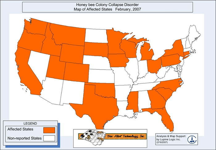
The author provided a very tiny honey bee picture that she probably found on google images. It would not work as the art, so I went online to find something better. For this type of article, I thought an infographic would be best, but I needed one ready-made. I searched articles from other publications on the same topic, but they merely had pictures of bees and beekeepers. The best inforgraphic I found at first was this one, but the map was boring and the information was dated, so I searched for something better. Finally I found this New York Times article and stole this graphic. I put the picture in photoshop and added credit to the NYT on the bottom right. The graphic I chose uses information from 2006, yet I decided to go with it rather than doing independent crop reasearch and creating a graph of my own. Even with the infographic the bee article needed to be broken up, so I included a pull quote.
I originally placed the story on top because I wanted it to be my lead story; however, the color from the second article's picture drew the eye down, forcing the reader to skip the big and unexciting gray chunk at the top. For this reason, I knew I had to run the eco-outreach article as the top story, but it was much shorter in comparison. To give the story more prominence, I used a hammer head and deck rather than a one line headline. Once I wrote the hammer head, I added color to the word "green" to attract the eye even more. I also wanted the green color to emphasize the environmental nature of the article.
Looking back, I would have written a better deck for the first article and a more interesting headline for the second story. (Although, I like the green thumbs, hands-on play on words.) Also, the hammer head would have been better if it stretched across half the article. Per Wes' suggestion, I would have deleted the box around the pull quote and graph.
Green! That's a great hammer, and I love the subtle line above it. I think I may have gone a little color overboard, in comparison; your page looks cleaner. Since your stories don't have any hard lines separating them, I think the pull quote and graph in the second story would actually look better without borders around them. A little more white space might be a small improvement.
ReplyDeleteI see what you mean. I think I forgot that was an option--to have a pull quote without a box. You're right it would look better. Thanks!
ReplyDeleteI actually really like what you did with the pull quote becuase I think it really attracts the readers attention and its a really good way to break up the text. And I also do not think you went overboard with the color in the title. I like when publications are creative like that because it makes it less boring! Good job!
ReplyDeleteThis is by far one of my favorite pages. I think you did a great job breaking up the text-heavy stories. I, like everyone else, love the simple green used in the headline. I think that one addition was subtle and classic but still dynamic for an inside page. In addition, I think the pull quote looks fine with the box, but it would've worked without one as well. The page is great.
ReplyDeleteYou did a great job breaking up a huge story on this page. Between the pull quote and the graphic, there is a lot to keep the reader's eye moving through the story.
ReplyDeleteI agree with Ashley-- your page is one of my favorites. The green really makes grabs the readers and makes your page pop. The overall layout of the articles and the photo elements flows across the page and keeps the reader's eye moving. The quote box and the graph are both nice touches and a great way to put a perspective on the bees story. Great Job!
ReplyDelete